DIGITAL ATELIER
Websites built to connect,
engage and perform
Selected Websites
MUSIC & ENTERTAINMENT
EF Music Production
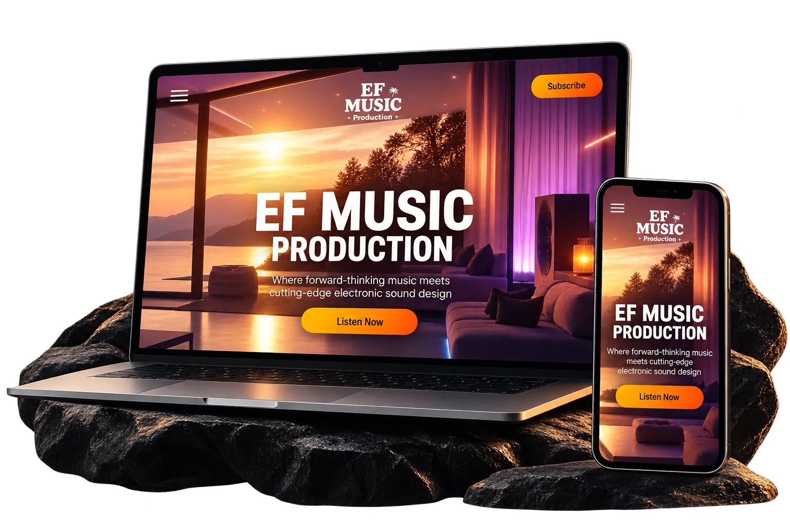
EF Music Production was designed as a central digital hub connecting the label with its artists, releases and evolving music catalogue.
The visual direction combines a bold, immersive atmosphere with strong color, oversized typography and music-led imagery. From this shared foundation, each artist opens into a distinct visual world, with its own palette, mood and graphic language, while remaining clearly connected to the EF Music ecosystem.
Behind the Project
EF Music Production needed more than a traditional label website. The platform was designed as a central point of entry for the brand, bringing together releases, artists and ongoing music projects within one coherent digital experience.
The main EF Music identity establishes the common visual language. Deep purples, vibrant gradients, warm sunset imagery and high-contrast typography create an energetic atmosphere inspired by contemporary electronic and Latin music culture. The interface was intentionally designed to feel immersive and expressive rather than corporate.
A key part of the project was creating a structure capable of supporting multiple artists without making them feel visually interchangeable.
Each artist therefore has a dedicated space with its own creative direction. Color palettes, imagery, typography treatments and overall mood shift to reflect the personality and genre of each project, from warmer tropical influences to darker electronic and techno aesthetics.
The challenge was to give these individual identities enough freedom to feel independent while still making it clear that they belong to the same EF Music ecosystem. Shared navigation patterns, content structures and interaction principles maintain consistency across the platform, while the art direction changes from artist to artist.
The main website acts as the connective layer between these different worlds, introducing the label, highlighting current releases and guiding visitors towards each artist’s individual experience.
The result is a flexible digital system rather than a single static website: one recognizable brand architecture capable of expanding as new artists, releases and creative directions are introduced.
LUXURY HOSPITALITY & TRAVEL
Villa Solarolo
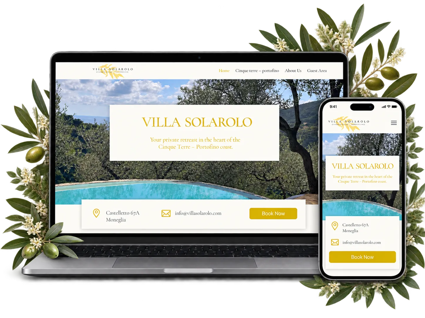
Villa Solarolo’s visual direction was designed to reflect the understated elegance of an exclusive Italian retreat.
Warm ivory tones, muted gold accents and refined serif typography create a calm, timeless atmosphere, while generous white space allows the property photography to take centre stage.
The result is a light and sophisticated digital experience that conveys privacy, authenticity and the relaxed character of the Portofino coast.
Behind the Project
Villa Solarolo is a private villa surrounded by the landscape of the Cinque Terre and Portofino coast. The website needed to present the property as more than accommodation, creating a sense of place and allowing visitors to experience its atmosphere before arriving.
The visual system was built around restraint. Rather than using an overtly luxurious aesthetic, the design relies on warm neutrals, soft ivory backgrounds and delicate golden details to communicate exclusivity in a more understated way.
Elegant serif typography reinforces the connection with Italian hospitality and gives the interface a timeless character. Gold is used selectively for headings, icons and calls to action, creating a consistent visual thread without overpowering the photography.
The layout was intentionally kept spacious and highly editorial. Large images of the villa, pool, interiors and surrounding landscape are given room to breathe, while shorter sections of copy introduce the property, rooms, location and practical information without interrupting the visual experience.
Small illustrated icons and refined informational blocks make key features easy to scan, while the booking and enquiry elements remain clearly visible throughout the page.
The final website presents Villa Solarolo as a peaceful and distinctive destination: elegant without feeling formal, luxurious without becoming excessive, and strongly connected to the landscape and character of the Italian Riviera.
DIGITAL WELL-BEING & SOCIAL IMPACT
TA-AF
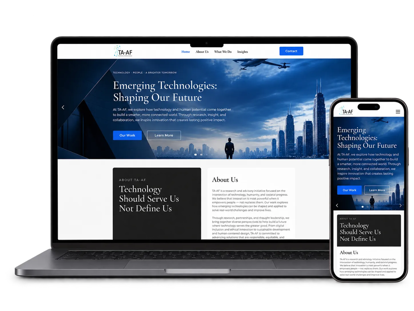
TA-AF is a nonprofit promoting a more balanced and conscious relationship with technology, encouraging people to benefit from innovation without becoming dependent on it.
The visual direction reflects this balance by combining the precision of a digital language with a more human and editorial approach. Deep blue, black and white create structure and credibility, while serif typography, real-life imagery and generous spacing keep the experience approachable and grounded.
Behind the Project
TA-AF was created around a clear idea: technology should support people and society, not dominate them. Its work focuses on raising awareness around digital well-being, responsible technology use and the social impact of increasingly connected lives.
For this reason, the visual identity needed to avoid two extremes. It could not feel anti-technology or nostalgic, but it also could not rely on the cold, hyper-futuristic aesthetic often associated with the technology sector.
The design was therefore built around balance.
Deep blue and black introduce authority, structure and a connection to the digital world, while large white areas create breathing room and make complex information easier to navigate. Serif typography adds a more human and editorial quality, helping the organization communicate serious topics without feeling institutional or distant.
Photography was also fundamental to the visual direction. Technology-focused imagery is paired with people, communities, education and everyday environments, reinforcing the idea that digital innovation should remain connected to real human experience.
Geometric elements and restrained blue accents provide continuity across the website, while the modular layout allows the organization to communicate research, initiatives, articles and calls to action within one coherent system.
The final result presents TA-AF as pro-technology, but pro-balance first: a nonprofit advocating for innovation that improves people’s lives without allowing technology to take control of them.
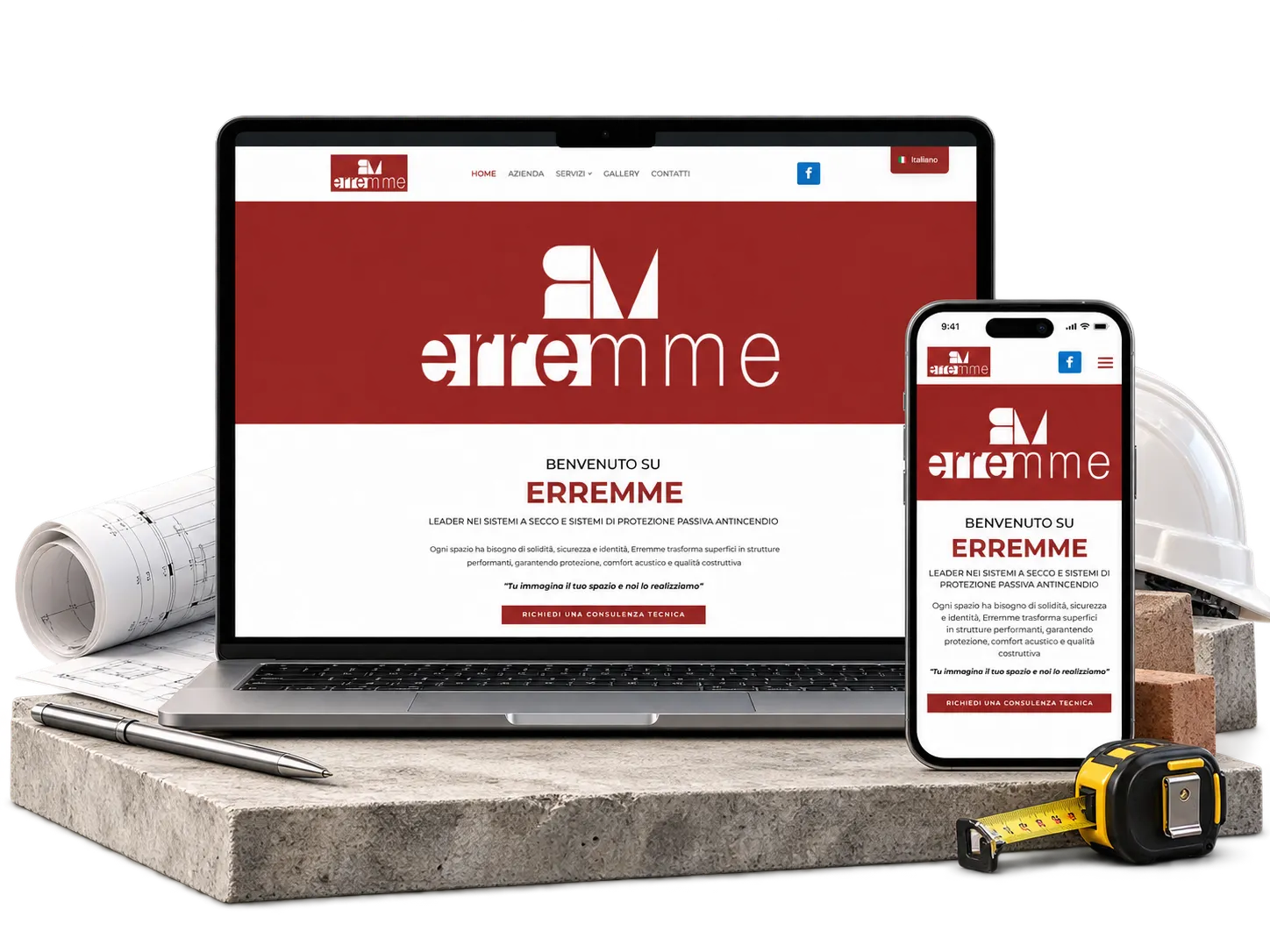
A solid identity built around experience
Erremme
The Erremme identity combines a bold geometric mark with a clean, contemporary wordmark. A deep red and white palette gives the brand a strong, confident presence, while the minimal construction keeps the system precise and professional. The result is a distinctive visual language that feels solid and technical, yet modern enough to work consistently across digital and corporate applications.
Behind the Project
Erremme operates in construction, renovation and specialist building systems, a field where reliability, technical expertise and precision are fundamental.
The visual direction was therefore built around a sense of solidity and structure. The geometric monogram gives the identity a compact, recognizable symbol, while the contrast between its stronger forms and the lighter wordmark creates a more contemporary balance.
The deep red was chosen as the dominant brand color to give Erremme a confident and immediately recognizable presence. Combined with white and generous negative space, it creates a clear visual system that can move easily between corporate communications, technical materials, signage and digital applications.
Rather than relying on decorative elements, the identity uses proportion, contrast and geometry to communicate professionalism. This restrained approach reflects the technical character of the company while giving the brand a cleaner and more distinctive image.
RENEWABLE ENERGY · EPC · ENERGY STORAGE
C-ENERGY24
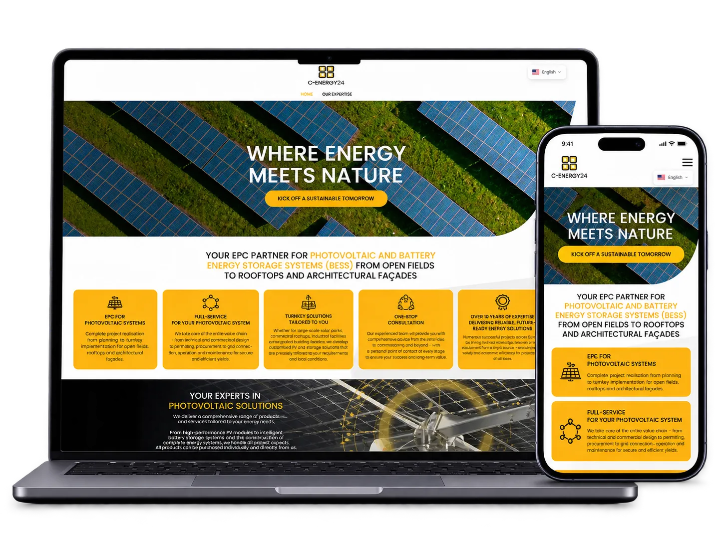
The C-ENERGY24 website translates a complex renewable-energy offer into a clear, structured and accessible digital experience.
Built around the company’s existing visual identity, the design combines a strong black, white and yellow palette with technical imagery, bold typography and modular content sections, giving the brand a confident and professional online presence.
Behind the Project
C-ENERGY24 operates across photovoltaic systems, battery energy storage, engineering and integrated energy solutions, supporting projects from open fields and rooftops to architectural façades.
The main challenge was to organise a broad and highly technical range of services in a way that remained easy to understand. The website was therefore structured around clear service blocks, strong visual hierarchy and concise explanations that guide visitors through the company’s capabilities.
The visual direction follows the existing C-ENERGY24 identity, using yellow as a strong accent against black and white backgrounds. Technical illustrations, product imagery and large-scale photography help communicate the engineering focus of the company without making the experience feel overly corporate or dense.
Particular attention was given to balancing technical credibility with accessibility. The result is a website that presents C-ENERGY24 as a reliable EPC partner while making its photovoltaic, battery storage and engineering services easier to explore for potential clients and partners.
LOREM IPSUM
Let's create something
exceptional together
Tell us where you are and where you want your brand to go.
We'll help shape the way forward.